class: center, middle, inverse, title-slide # Getting back into R - and how to handle messy data ## Advanced Research Methods and Skills ### 2021/03/16 --- # Topics previously covered - Data visualization - Using **ggplot2** - Data manipulation - Using **dplyr** - Basic statistics - t-tests, correlations - regression - ANOVA --- # Themes for today .pull-left[ - Refamiliarizing yourself with R - Basic data transformations - Missing data ] .pull-right[   ] ??? Tidy data figure from https://r4ds.had.co.nz/tidy-data.html, distributed under a CC BY-NC-ND 3.0 US license --- # Tabular data .pull-left[ ``` ## # A tibble: 16 x 4 ## Participant Viewpoint Block RT ## <int> <chr> <chr> <dbl> ## 1 1 Different First 585. ## 2 1 Different Second 443. ## 3 1 Same First 446. ## 4 1 Same Second 385. ## 5 2 Different First 388. ## 6 2 Different Second 310. ## 7 2 Same First 571. ## 8 2 Same Second 400. ## 9 3 Different First 490. ## 10 3 Different Second 424. ## 11 3 Same First 566. ## 12 3 Same Second 437. ## 13 4 Different First 464. ## 14 4 Different Second 406. ## 15 4 Same First 461. ## 16 4 Same Second 389. ``` ] .pull-right[ Tables of data are what you're most commonly dealing with in R. This one confirms to the **tidy data** principles: One row per observation, one column per variable  ] ??? Tidy data figure from https://r4ds.had.co.nz/tidy-data.html, distributed under a CC BY-NC-ND 3.0 US license --- # Different types of file The most common file formats you'll deal with are either Excel files or text files, but you may also find dealing with SPSS files useful. Fortunately, R has several functions and packages for importing data! |File formats| File extension| Functions| Package| |-|-|-|-| |SPSS | .sav| **read_sav()**| library(haven)| |Excel | .xls, .xlsx|**read_excel()**|library(readxl)| |Text | .csv, .txt, .* |**read_csv()**, **read_delim()**|library(readr)| --- background-image: url(../images/dplyr-logo.png) background-size: 6% background-position: 90% 5% # Data wrangling **dplyr** is a really useful package for manipulation of data tables. |Function |Effect| |------------|----| | select() |Include or exclude variables (columns)| | arrange() |Change the order of observations (rows)| | filter() |Include or exclude observations (rows)| | mutate() |Create new variables (columns)| | group_by() |Create groups of observations| | summarise()|Aggregate or summarise groups of observations (rows)| --- background-image: url(../images/ggplot2-logo.png) background-size: 8% background-position: 85% 5% # Quickly plotting your data .pull-left[ Plottting data is really important for all aspects of data analysis. The **ggplot2** package provides a framework for doing this: ```r ggplot(example_rt_df, aes(x = RT, fill = Block)) + geom_density(alpha = 0.5) + theme_bw() ``` ] .pull-right[  ] --- # Running statistics The humble t-test... ```r t.test(RT~Block, data = example_rt_df) ``` ``` ## ## Welch Two Sample t-test ## ## data: RT by Block ## t = 14.647, df = 195.62, p-value < 2.2e-16 ## alternative hypothesis: true difference in means is not equal to 0 ## 95 percent confidence interval: ## 84.85445 111.26025 ## sample estimates: ## mean in group First mean in group Second ## 496.6045 398.5472 ``` --- # Running statistics The factorial ANOVA... (the aov_ez() function from the *afex* package) ```r aov_ez(dv = "RT", within = c("Block", "Viewpoint"), id = "Participant", data = example_rt_df) ``` ``` ## Anova Table (Type 3 tests) ## ## Response: RT ## Effect df MSE F ges p.value ## 1 Block 1, 49 2075.04 231.69 *** .525 <.001 ## 2 Viewpoint 1, 49 2793.94 2.08 .013 .156 ## 3 Block:Viewpoint 1, 49 1886.08 1.39 .006 .244 ## --- ## Signif. codes: 0 '***' 0.001 '**' 0.01 '*' 0.05 '+' 0.1 ' ' 1 ``` --- # Reminder! .pull-left[  ] .pull-right[ [RStudio.cloud](https://rstudio.cloud) has a selection of built-in exercises covering a lot of the topics we've done before. If you need a bit of practice, try going through them again! Also **USE THE DROP-INS**, use the discussion board, and use the Teams channel! Each week, Matt will go over the exercises for that week, twice, half-way through the scheduled drop-in times - so at 1000 and 1200! ] --- class: center, inverse, middle # How to handle "messy" or otherwise awkward data --- # The ideal data In an ideal world all our data would be beautifully normal: ``` ## `geom_smooth()` using formula 'y ~ x' ``` <!-- --> --- # The real data But reality is rarely so kind. Data can be all kinds of messy. It can have *outliers*... ``` ## `geom_smooth()` using formula 'y ~ x' ``` <!-- --> --- # The real data Data can be *missing*... .pull-left[ ``` ## `geom_smooth()` using formula 'y ~ x' ``` <!-- --> ] .pull-right[ ``` ## X1 X2 ## 1 NA 10.947604 ## 2 NA 10.201614 ## 3 NA 11.187796 ## 4 NA 10.516434 ## 5 NA 11.432880 ## 6 11.34700 NA ## 7 10.42997 NA ## 8 9.40423 11.273099 ## 9 11.28971 9.676211 ## 10 11.23485 10.351039 ``` Complete cases = 193 ] --- # The real data Data can be *skewed*... <!-- --> --- # The real data .pull-left[ <!-- --> ] .pull-right[ There can be any combination of these things... All of these pose problems for estimating the properties of our data, the relationships between variables, and the phenomena we are investigating. ] --- class: center, inverse, middle # Handling outliers --- # What is an outlier? Two out of the 200 pairs of x-y values were replaced. The resulting coefficient (approx *r* = .49) is *way-off* the true coefficient for these data. .pull-left[ ``` ## `geom_smooth()` using formula 'y ~ x' ``` <!-- --> ] .pull-right[ ``` ## `geom_smooth()` using formula 'y ~ x' ``` <!-- --> ] --- # What is an outlier? .pull-left[ The problem gets even worse with smaller sample sizes. Here there are 50 datapoints with two outliers, rather than 200. The correlation coefficient becomes even *more* biased than it was previously. ] .pull-right[ ``` ## `geom_smooth()` using formula 'y ~ x' ``` <!-- --> ] --- # What should we do with outliers? Three common approaches: 1. **Remove them** - If you're sure these reflect an error, not genuine data, then removal is a possibility. -- 2. **Transformation** - *rescaling* or *transforming* your data may help reduce the influence of outliers. (We'll come back to this!) -- 3. **Replace them** - Replacing the outliers with values `\(\pm\)` 2-3 standard deviations away from the mean. --- class: center, inverse, middle # Identifying and replacing outliers --- # Identifying outliers Plotting your data can be an excellent way to spot outliers: here they're *very* obvious! ``` ## `geom_smooth()` using formula 'y ~ x' ``` <!-- --> --- # Identifying outliers Plotting the residuals of your linear model will also help you identify troublesome observations. ```r plot(lm(X1 ~ X2, data = temp_df_out)) ``` .pull-left[ <!-- --> ] .pull-right[ <!-- --> ] --- # Identifying outliers Plotting the residuals of your linear model will also help you identify troublesome observations. .pull-left[ <!-- --> ] .pull-right[ <!-- --> ] --- # Identifying outliers .pull-left[ Sometimes a *threshold* is used to determine whether an observation is an outlier. Sometimes this is driven by common sense: e.g. a value of 120 for a participant's age is **extremely** unlikely to be genuine. Sometimes this is *data-driven*: e.g. values more than `\(\pm\)` 3 standard deviations away from the mean are *unusual*. ] .pull-right[ <!-- --> ] --- # Scaling by the mean and standard deviation .panelset[ .panel[.panel-name[The data] ```r example <- c(rnorm(15), 35) hist(example) ``` <!-- --> ] .panel[.panel-name[Manually scale] ```r example ``` ``` ## [1] -0.08161556 -0.54103224 -1.61888484 -1.54202514 -0.22356538 -0.20636312 ## [7] -0.62619258 0.54246671 0.68777589 0.93359173 -1.54955092 0.04244581 ## [13] 1.35347133 -1.66231487 -1.42252672 35.00000000 ``` ```r (example - mean(example)) / sd(example) ``` ``` ## [1] -0.21338597 -0.26499671 -0.38608236 -0.37744796 -0.22933258 -0.22740008 ## [7] -0.27456360 -0.14327675 -0.12695276 -0.09933788 -0.37829341 -0.19944896 ## [13] -0.05216873 -0.39096128 -0.36402355 3.72767256 ``` ] .panel[.panel-name[`scale()`] ```r # you don't need to use t() - that transposes the values so they fit on the slide :) # Just use scale() t(scale(example)) ``` ``` ## [,1] [,2] [,3] [,4] [,5] [,6] [,7] ## [1,] -0.213386 -0.2649967 -0.3860824 -0.377448 -0.2293326 -0.2274001 -0.2745636 ## [,8] [,9] [,10] [,11] [,12] [,13] ## [1,] -0.1432768 -0.1269528 -0.09933788 -0.3782934 -0.199449 -0.05216873 ## [,14] [,15] [,16] ## [1,] -0.3909613 -0.3640235 3.727673 ## attr(,"scaled:center") ## [1] 1.817855 ## attr(,"scaled:scale") ## [1] 8.901572 ``` ] ] --- # Removing values above a threshold The **filter()** function from dplyr can be used to remove outliers easily! .panelset[ .panel[.panel-name[With outliers] .pull-left[ ```r temp_df_out %>% ggplot(aes(x = X1, y = X2)) + geom_point() + theme_bw() + stat_smooth(method = "lm") ``` ``` ## `geom_smooth()` using formula 'y ~ x' ``` ] .pull-right[  ] ] .panel[ .panel-name[Without outliers] .pull-left[ ```r temp_df_out %>% dplyr::filter(X1 < 15) %>% ggplot(aes(x = X1, y = X2)) + geom_point() + theme_bw() + stat_smooth(method = "lm") ``` ``` ## `geom_smooth()` using formula 'y ~ x' ``` ] .pull-right[  ] ] ] --- class: center, inverse, middle # Data transformation --- # Skewed data Skewed data is data that *leans* in a particular direction. These are often described by the direction of the "long-tail" - so a left-tailed distribution means a distribution with a long tail on the left, rather than most values on the left. .center[ <!-- --> ] --- # Skewed data .pull-left[ <!-- --> ] .pull-right[ This data is *right-tailed*. This is sometimes also called *positively skewed*. For this type of data, the mean (blue line) is usually higher than the median (red, dashed line). This type of skew is relatively common with data that is *bounded* at zero. e.g. reaction time data, the distribution of wages ] --- # Left-tailed skew .pull-left[ <!-- --> ] .pull-right[ Data skewed the opposite way - many high scores but few low scores - has a long *left* tail. This is also called *negative skew*. The mean (blue solid line) is usually less than the median (red dashed line). ] --- # Transformation of skewed data One way to handle skew is to transform the data to a different *scale*. Transformation type| code| -------|--- Log|log(X) Square root|sqrt(X) Reciprocal | 1 / X Square | x^2 (See Section 5.8.2 in Field et al., DSUR) --- # Transformation of skewed data .panelset[ .panel[.panel-name[Right-tailed] 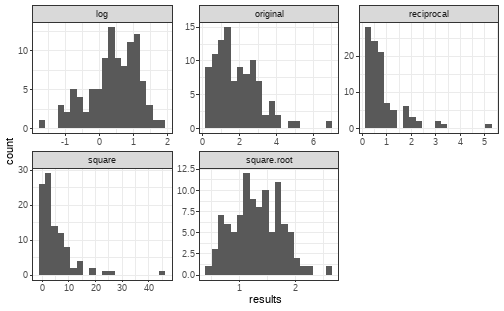<!-- --> ] .panel[.panel-name[Left-tailed] 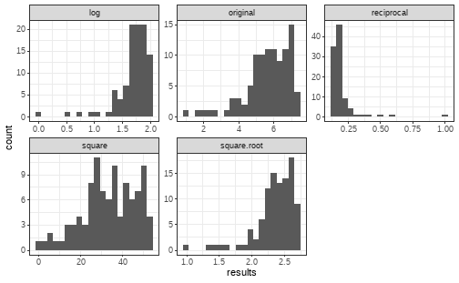<!-- --> ] ] --- class: center, inverse, middle # Handling missing data --- # Types of missing data .pull-left[ - Missing Completely At Random - Missingness does not depend on anything - Missing At Random - Missingness depends on the observed data - Missing Not At Random - Missingness depends on the missing data ] .pull-right[ <blockquote class="twitter-tweet"><p lang="en" dir="ltr">In today's lecture, I tried to redefine missing data types (MCAR, MAR, MNAR) as different reasons a dog might eat your homework. This needs more work, but audience seemed to appreciate it. <a href="https://t.co/i9Z8sYrqWQ">pic.twitter.com/i9Z8sYrqWQ</a></p>— Richard McElreath (@rlmcelreath) <a href="https://twitter.com/rlmcelreath/status/1101435108995805185?ref_src=twsrc%5Etfw">March 1, 2019</a></blockquote> <script async src="https://platform.twitter.com/widgets.js" charset="utf-8"></script> ] --- # Missing Completely At Random .pull-left[ If you have missing data, MCAR is the best kind of missing data. There is nothing *systematic* about which data is missing. For example, all your participants filled out three different questionnaires. Unfortunately, your dog chewed through a pile of them, and half of your participants now have only two questionnaires. ] .pull-right[ ``` ## X1 X2 X3 ## 1 NA 10.564509 12.00366 ## 2 NA 11.134840 12.46372 ## 3 NA 8.197005 11.06698 ## 4 NA 9.704088 14.19018 ## 5 NA 8.706921 13.03839 ## 6 8.344476 9.537686 12.89438 ## 7 11.263166 7.791435 13.76203 ## 8 8.669327 8.276546 12.92337 ## 9 8.377079 9.164257 11.07893 ## 10 9.288548 6.947327 12.80245 ``` ] --- # Missing At Random .pull-left[ ``` ## X1 X2 X3 age ## 1 11.047154 9.130396 12.86073 19 ## 2 8.509500 10.760188 12.07602 20 ## 3 11.619125 9.636584 13.04400 19 ## 4 11.212559 7.600109 11.90494 20 ## 5 10.951217 9.341155 13.35871 19 ## 6 9.286955 10.227833 12.48842 19 ## 7 9.555602 8.320163 NA 36 ## 8 10.394811 7.726169 15.13988 19 ## 9 8.376943 8.289583 NA 26 ## 10 10.528843 8.812628 13.50900 20 ``` ] .pull-right[ Confusingly, Missing At Random (MAR) data is not missing (completely) at random. For example, for some reason, people older than 21 typically failed to complete the third questionnaire. This data is MAR - whether the data in the third column is missing is related to the value of the fourth column. ] --- # Missing Not At Random .pull-left[ ``` ## X1 X2 X3 age ## 1 11.095201 8.235348 NA 19 ## 2 11.159246 9.198542 NA 19 ## 3 11.026114 11.395065 NA 29 ## 4 10.723638 10.066800 NA 19 ## 5 11.399608 11.517779 NA 19 ## 6 10.051001 9.103957 12.61627 18 ## 7 9.073119 7.654592 13.10197 42 ## 8 10.110520 10.048114 12.38895 29 ## 9 9.729318 10.017504 NA 19 ## 10 11.901271 9.132584 13.14818 52 ``` ] .pull-right[ The final, most troubling type of missing data is data that is Missing Not At Random (MNAR). For example, imagine that the questionnaire relates to depression; people who score high for depression are less likely to complete the final questionnaire. In this case, the values that are missing for the third questionnaire depends on the value of the responses to that questionnaire, so this data is MNAR. ] --- # Dealing with missing data .pull-left[ List-wise deletion: Cases with missing data are completely **removed** from **all** analysis. Pair-wise deletion: Cases with missing data are only **removed** from **comparisons where one or more variables are missing**. By default, functions such as **mean()** return NA if any value in the input is NA/missing. ] .pull-right[ ```r mean(temp_df_missing$X1) ``` ``` ## [1] NA ``` ```r mean(temp_df_missing$X1, na.rm = TRUE) ``` ``` ## [1] 10.00744 ``` ```r sum(complete.cases(temp_df_missing)) ``` ``` ## [1] 193 ``` ] --- # Single Imputation Replace missing values with a simple "best-guess". e.g. Using the mean or the median for the condition. .pull-left[ ```r orig_data <- 1:12 orig_data ``` ``` ## [1] 1 2 3 4 5 6 7 8 9 10 11 12 ``` ```r mean(orig_data) ``` ``` ## [1] 6.5 ``` ] .pull-right[ ```r missing_one <- orig_data missing_one[6] <- NA missing_one ``` ``` ## [1] 1 2 3 4 5 NA 7 8 9 10 11 12 ``` ```r mean(missing_one, na.rm = TRUE) ``` ``` ## [1] 6.545455 ``` ] --- # Single Imputation Replace missing values with a simple "best-guess". e.g. Using the mean or the median for the condition. .pull-left[ ```r replace_one <- missing_one replace_one[6] <- mean(missing_one, na.rm = TRUE) mean(replace_one) ``` ``` ## [1] 6.545455 ``` ```r mean(orig_data) ``` ``` ## [1] 6.5 ``` ] Problem: the mean and median are biased by the missing data. And replacing a missing value with one of these values tends to artificially reduce variability. --- ## Multiple Imputation In **multiple** imputation, we replace missing values with estimates based on a *model* of the data that incorporates uncertainty about what the value should be. We create a model based on the data that is not missing, and use its predictions to guess the values that the missing data has. We do this multiple times and then take an average or *pool* the results to fill in the gap. Packages such as **mice** and **Amelia** can do this for us, and help us identify patterns of missingness. --- # Alternative approaches to missing data, skew, and other oddities Generalized Linear Models (as opposed to General Linear Models) allow modelling of data of many different types without necessitating transformations. For example, counts can be modelled using Poisson regression, and categorical outcomes can be modelled with logistic regression. *Multilevel* or *mixed*-models can handle all of these things and much more besides; they are perfectly capable of handling missing data. We'll cover both logistic regression and multilevel models later in the course! --- # Next week Look into power and effect sizes: See Field et al, Discovering Statistics Using R, pages 56-59, Sections on: - Type I and Type II error (2.6.3) - effect sizes (2.6.4) - statistical power (2.6.5) Cohen, J. (1992). A power primer. Psychological Bulletin, 112(1), 155-159. http://dx.doi.org/10.1037/0033-2909.112.1.155