class: center, middle, inverse, title-slide # Visualizing data ## PSY9219M & PSY9251M ### 9/11/2021 --- # Data frames and tibbles .pull-left[ ``` ## # A tibble: 16 x 4 ## # Groups: Participant [8] ## Participant Viewpoint B1RT B2RT ## <int> <chr> <dbl> <dbl> ## 1 1 Different 453. 428. ## 2 1 Same 439. 387. ## 3 2 Different 515. 341. ## 4 2 Same 475. 392. ## 5 3 Different 458. 285. ## 6 3 Same 455. 474. ## 7 4 Different 587. 345. ## 8 4 Same 465. 483. ## 9 5 Different 540. 304. ## 10 5 Same 483. 376. ## 11 6 Different 476. 446. ## 12 6 Same 496. 360. ## 13 7 Different 529. 365. ## 14 7 Same 563. 442. ## 15 8 Different 514. 352. ## 16 8 Same 472. 373. ``` ] .pull-right[ .large[ Data frames/tibbles are structured tables of data. Each column contains data of the same basic type (i.e. a column can be numeric or character, but not both). ] ] --- background-image: url(images/03/tidy-1.png) background-position: 50% 70% background-size: 75% # Tidy data 1. Each variable must have its own column. 2. Each observation must have its own row. 3. Each value must have its own cell. --- # Reshaping your data .large[ The **tidyr** package has functions for *reshaping* data in order to make it *tidy*. ] .center[ 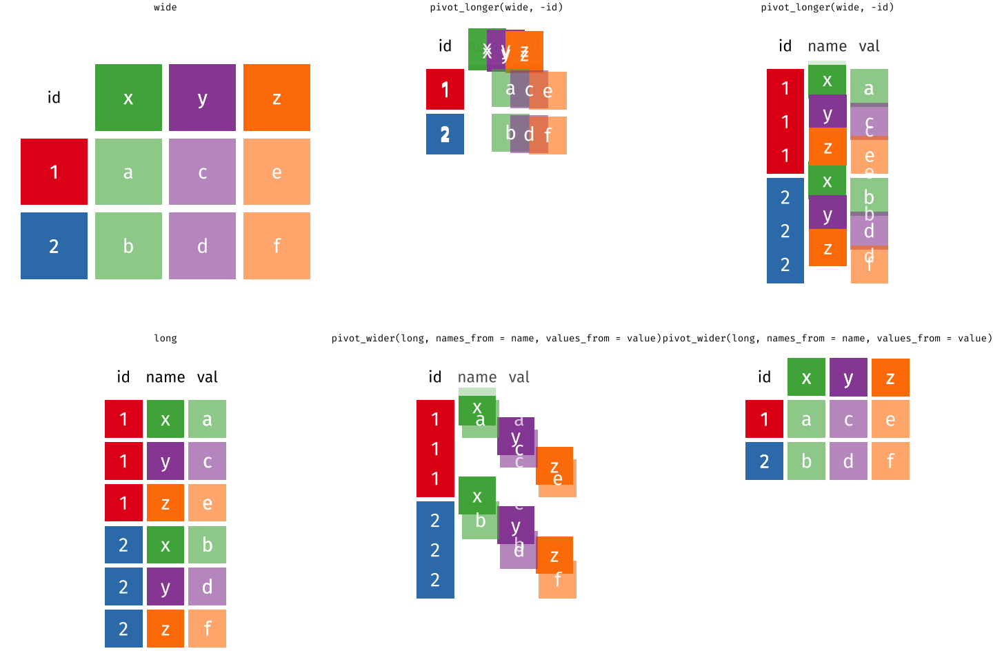 ] --- class: inverse, middle, center # Visualizing data --- # Why visualize data? .pull-left[ .large[ 1. Graphs help you rapidly examine the structure of the data. 2. Graphs help you communicate the important statistical features of data. 3. It's often easier to spot unexpected issues using graphs than staring at a bunch of numbers. ] ] .pull-right[ 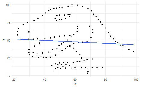<!-- --> ] --- # Getting a quick look at your data Plotting helps you quickly gain an understanding of the structure of your data. Here's some recent data about the UK's prison population. ``` ## # A tibble: 22,409 x 6 ## View Date Establishment Sex `Age / Custody / Nationa~ Population ## <chr> <chr> <chr> <chr> <chr> <dbl> ## 1 a Establishm~ 2015-~ Altcourse Male Adults (21+) 922 ## 2 a Establishm~ 2015-~ Altcourse Male Juveniles and Young Adul~ 169 ## 3 a Establishm~ 2015-~ Ashfield Male Adults (21+) 389 ## 4 a Establishm~ 2015-~ Askham Grange Fema~ Adults (21+) NA ## 5 a Establishm~ 2015-~ Askham Grange Fema~ Juveniles and Young Adul~ NA ## 6 a Establishm~ 2015-~ Aylesbury Male Adults (21+) 113 ## 7 a Establishm~ 2015-~ Aylesbury Male Juveniles and Young Adul~ 268 ## 8 a Establishm~ 2015-~ Bedford Male Adults (21+) 459 ## 9 a Establishm~ 2015-~ Bedford Male Juveniles and Young Adul~ 30 ## 10 a Establishm~ 2015-~ Belmarsh Male Adults (21+) 794 ## # ... with 22,399 more rows ``` Retrieved from [data.gov.uk](https://data.gov.uk/dataset/f3f79bba-d74a-4c6a-85f3-f29881349a34/offender-management-statistics) - Contains public sector information licensed under the Open Government Licence v3.0. --- # Getting a quick look at your data .pull-left[ Let's look at the UK prison population as of December 2017, split by establishment, sex, and age group. First we filter out all but the rows I'm interested in. Don't worry about understanding this code... (yet!) ```r pris_pop %>% filter(View == "a Establishment*Sex*Age Group", Date == "2017-12") %>% ggplot(aes(x = Population)) + stat_bin(binwidth = 100) ``` ] .pull-right[ 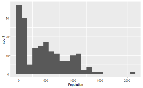 ] --- # Getting a quick understanding of your data .pull-left[ This is a histogram showing the distribution of prison populations in bins of 100 inmates. Some obvious features: 1. The data is heavily skewed - lots of small values, few large values. 2. There may be a mixture of distributions - there's a big peak in the low numbers, then a dip, then a broader peak. These two features suggest that there may be some structure we're missing with this plot. ] .pull-right[  ] --- # Getting a quick understanding of your data .pull-left[ In the data, age is coded into "Juveniles and Young Adults (15-20)" and "Adults (21+)". Let's see if Age underlies some of the features of the first plot. ```r pris_pop %>% filter(View == "a Establishment*Sex*Age Group", Date == "2017-12") %>% ggplot(aes(x = Population, fill = `Age / Custody / Nationality / Offence Group`)) + stat_bin(binwidth = 100, position = "dodge") + labs(fill = "Age") ``` ] .pull-right[  ] --- # Getting a quick understanding of your data .pull-left[ The "Juvenile" prison population underlies the lower peak. Typically there are fewer than 200 juveniles in a given institution. In addition, there are far fewer juveniles in prison than adults. Note that while many institutions hold both adults and juveniles, some hold only adults and some hold only juveniles. ] .pull-right[  ] --- # Getting a quick understanding of your data .pull-left[ How do prison populations vary between men and women? Here we focus on adults, excluding juveniles from the plot. ```r pris_pop %>% rename(Age = `Age / Custody / Nationality / Offence Group`) %>% filter(View == "a Establishment*Sex*Age Group", Date == "2017-12", Age == "Adults (21+)") %>% ggplot(aes(x = Population, fill = Sex)) + stat_bin(binwidth = 100, position = "dodge") ``` ] .pull-right[ 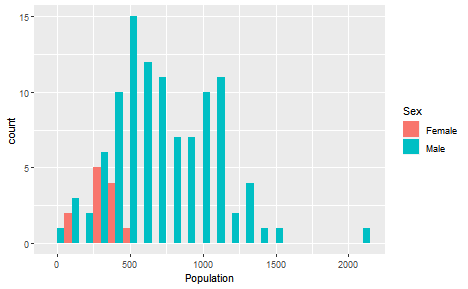 ] --- # Getting a quick understanding of your data .pull-left[ We can clearly see that there are far more men in prison than women. There are also far fewer institutions that hold women than institutions that hold men. Also there are generally more men in any given institution than there are women. ] .pull-right[  ] --- # Communicating your results Plots are also useful for showing the statistical patterns in your data to go along with statistical tests. .pull-left[ 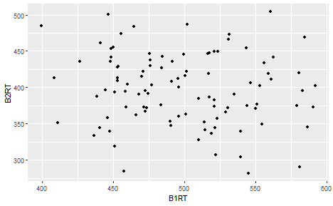<!-- --> ] .pull-right[ 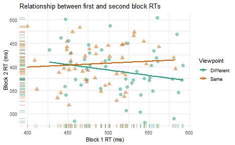<!-- --> ] --- # Communicating patterns .pull-left[ 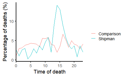<!-- --> ] .pull-right[ .large[ Strikingly different to similar GPs, many of Harold Shipman's patients died at a particular time of day. A pattern like this passes the "inter-ocular trauma" test... Spiegelhalter (2019), *The Art of Statistics* ] ] --- # Spotting problems in your data .pull-left[ ## Anscombe's Quartet Every one of these plots shows sets of data with the same means, standard deviations, and correlation coefficients. One is non-linear, one has an outlier, and one should have a categorical x-axis! ] .pull-right[ 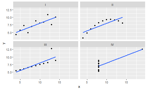 ] --- # Spotting problems in your data ## The Datasaurus Dozen .pull-left[ 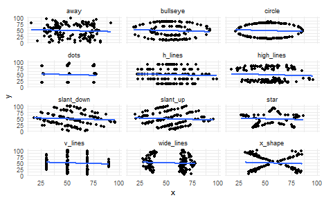 ] .pull-right[ <!-- --> ] --- background-image: url(images/04/ggplot2-logo.png) background-size: 15% background-position: 50% 85% class: inverse, middle, center # The Grammar of Graphics --- background-image: url(images/04/ggplot2-logo.png) background-size: 8% background-position: 85% 5% # ggplot2 .pull-left[ **ggplot2** is one of the **tidyverse** packages. GG stands for the *Grammar* of *Graphics*. The Grammar of Graphics is a principled approach to building plots from a few underlying structures: 1. A dataset 2. A coordinate system 3. *Geoms* (geometric shapes such as bars or points) We begin with a blank canvas: ```r ggplot() ``` ] .pull-right[  ] --- background-image: url(images/04/ggplot2-logo.png) background-size: 8% background-position: 85% 5% # The mpg dataset ```r mpg ``` ``` ## # A tibble: 234 x 11 ## manufacturer model displ year cyl trans drv cty hwy fl class ## <chr> <chr> <dbl> <int> <int> <chr> <chr> <int> <int> <chr> <chr> ## 1 audi a4 1.8 1999 4 auto~ f 18 29 p comp~ ## 2 audi a4 1.8 1999 4 manu~ f 21 29 p comp~ ## 3 audi a4 2 2008 4 manu~ f 20 31 p comp~ ## 4 audi a4 2 2008 4 auto~ f 21 30 p comp~ ## 5 audi a4 2.8 1999 6 auto~ f 16 26 p comp~ ## 6 audi a4 2.8 1999 6 manu~ f 18 26 p comp~ ## 7 audi a4 3.1 2008 6 auto~ f 18 27 p comp~ ## 8 audi a4 quattro 1.8 1999 4 manu~ 4 18 26 p comp~ ## 9 audi a4 quattro 1.8 1999 4 auto~ 4 16 25 p comp~ ## 10 audi a4 quattro 2 2008 4 manu~ 4 20 28 p comp~ ## # ... with 224 more rows ``` --- background-image: url(images/04/ggplot2-logo.png) background-size: 8% background-position: 85% 5% # Datasets and aesthetics .pull-left[ The first step is to add dataset and define some *aesthetics*. Aesthetics are how we map elements of the data to parts of the plot. The first two arguments to `ggplot()` are `data` and `mapping`. We use the `aes()` function within this to map columns from the data to properties of the plot. Here we use the 'displ' and 'hwy' columns from the *mpg* dataset to set up our co-ordinate system. ```r ggplot(data = mpg, mapping = aes(x = displ, y = hwy)) ``` ] .pull-right[ 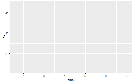 ] --- background-image: url(images/04/ggplot2-logo.png) background-size: 8% background-position: 85% 5% # Geoms and layers .pull-left[ **geoms** are the geometric shapes we want to use to represent our data. We add a new layer to our initial canvas using `+`, and then use one of the many `geom_*` functions to draw shapes on the new layer. For a scatterplot, add a new layer using `geom_point()`. ```r ggplot(data = mpg, mapping = aes(x = displ, y = hwy)) + geom_point() ``` ] .pull-right[ 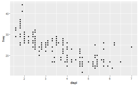 ] --- background-image: url(images/04/ggplot2-logo.png) background-size: 8% background-position: 85% 5% # Adding a linear model .pull-left[ A question we're pondering is what is the relationship between the variables on x- and y-axes? We can add a linear regression line using `geom_smooth()` and specifying "lm" (linear model) for the argument method. ```r ggplot(data = mpg, mapping = aes(x = displ, y = hwy)) + geom_point() + geom_smooth(method = "lm", se = FALSE) + labs(x = "Engine displacement (litres)", y = "Highway miles per gallon") ``` ] .pull-right[ 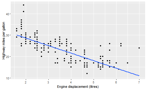 ] --- background-image: url(images/04/ggplot2-logo.png) background-size: 8% background-position: 85% 5% # Identifying groups .pull-left[ Another variable we know about is the number of cylinders in the engines - the *cyl* column. *cyl* only has four unique levels, so it's best treated as a categorical variable and converted to a factor using `factor()`. Here, we use colour to identify different levels of *cyl*. ```r ggplot(data = mpg, mapping = aes(x = displ, y = hwy, colour = factor(cyl))) + geom_point() + labs(x = "Engine displacement (litres)", y = "Highway miles per gallon", colour = "Cylinders") ``` ] .pull-right[ 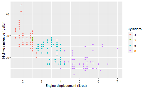 ] --- background-image: url(images/04/ggplot2-logo.png) background-size: 8% background-position: 85% 5% # Identifying groups .pull-left[ And we can also add linear regression lines for each grouping of cylinders, again using `geom_smooth()`. ```r ggplot(data = mpg, mapping = aes(x = displ, y = hwy, colour = factor(cyl))) + geom_point() + geom_smooth(method = "lm", se = FALSE) + labs(x = "Engine displacement (litres)", y = "Highway miles per gallon", colour = "Cylinders") ``` ] .pull-right[ 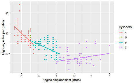 ] --- class: inverse, center, middle # Plotting categorical and continuous data --- # Plotting a single categorical variable .pull-left[ Typically with a single categorical variable, we want a frequency count - i.e. we want to know how many times each category shows up. A bar graph is ideal! For example, there are several different *classes* of vehicle in in the *mpg* dataset. How many times does each one show up? ```r ggplot(mpg, aes(x = class)) + geom_bar() ``` `geom_bar()` will count for us, so we don't need to supply a *y* aesthetic `aes()`. ] .pull-right[ 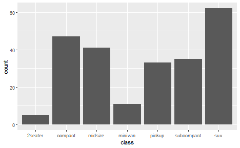 ] --- # Plotting a single categorical variable .pull-left[ As with plots we did earlier, the bars can be coloured in. With `geom_point()` we change the `colour` aesthetic. For `geom_bar()` we need to change the `fill` aesthetic. ```r ggplot(mpg, aes(x = class, fill = class)) + geom_bar() ``` ] .pull-right[ 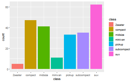 ] --- # Plotting multiple categorical variables .pull-left[ The fill doesn't have to use the same variable as the `x` variable. For example, you may want to see how each count breaks down into groups of another categorical variable. ```r ggplot(mpg, aes(x = class, fill = factor(cyl))) + geom_bar() ``` ] .pull-right[  ] --- # Plotting multiple categorical variables .pull-left[ Alternatively, you may want to produce different graphs for each level of the other categorical variable A nice way to do that is using **facets**, adding a `facet_wrap()` or `facet_grid()` layer to the *ggplot*. ```r ggplot(mpg, aes(x = class)) + geom_bar() + facet_wrap(~factor(cyl)) + theme(axis.text.x = element_text(angle = 45)) ``` ] .pull-right[  ] --- class: inverse, center, middle # Plotting continuous variables --- # Plotting a single continuous variable .pull-left[ A lot of the time you'll be dealing with continuous, numerical variables. What you often want to do is check how they are distributed (we'll go into this later in the course!). Histograms split continuous variables up into discrete bins, and count how many of each value show up in each bin. Here we use `geom_histogram()`. By default, it splits data into 30 bins. ```r ggplot(mpg, aes(x = displ)) + geom_histogram() ``` ] .pull-right[  ] --- # Plotting a single continuous variable .pull-left[ Changing the number of bins can have quite dramatic results on the plots. There are no hard and fast rules how many bins you need. ```r ggplot(mpg, aes(x = displ)) + geom_histogram(bins = 50) ``` ```r ggplot(mpg, aes(x = displ)) + geom_histogram(bins = 10) ``` ] .pull-right[ <!-- --> ] --- # Plotting a single continuous variable .pull-left[ Rather than choosing a number of bins, you can also set the `binwidth`, in the same units as the variable. For example, here it's set to make one bin every .5 units of the `displ` variable. ```r ggplot(mpg, aes(x = displ)) + geom_histogram(binwidth = .5) ``` ] .pull-right[  ] --- # Plotting a single continuous variable .pull-left[ An alternative to using a histogram is to plot a **kernel density estimate (KDE)**. An advantage of the KDE (other than the fancy-sounding name) is that it provides smooth estimate over the range of the data and is much less dependent on an arbitrary parameter like "number of bins". We draw a KDE using `geom_density()`. ```r ggplot(mpg, aes(x = displ)) + geom_density(fill = "grey") ``` ] .pull-right[  ] --- # Plotting two continuous variables The best type of plot for showing the relationship between two continuous variables is a **scatterplot**. .pull-left[ ```r ggplot(data = mpg, mapping = aes(x = displ, y = hwy, colour = factor(cyl))) + geom_point(size = 3, alpha = 0.5, aes(shape = factor(cyl))) + geom_smooth(method = "lm", se = FALSE) ``` ] .pull-right[  ] --- class: inverse, middle, center # Continuous by categorical interactions --- # Continuous by categorical interactions .pull-left[ Often when working with continuous data, you have additional categorical variables. It's often easiest to put splits based on categorical variables side-by-side on the same plot. Here we use `geom_histogram(position = "dodge")` to put the bars side-by-side. ```r ggplot(pris_pop, aes(x = Population, fill = Age)) + geom_histogram(binwidth = 100, position = "dodge") ``` ] .pull-right[  ] --- # Continuous by categorical interactions .pull-left[ Another way to do this would be using kernel density estimates. `geom_density()` uses the *fill* aesthetic for this. Since the densities overlap, we can manipulate the *transparency* of the geom using the *alpha* argument. Note that this can be applied to most *geoms* and is often useful when there is overlap. ```r ggplot(pris_pop, aes(x = Population, fill = Age)) + geom_density(alpha = 0.5) ``` ] .pull-right[  ] --- # Continuous by categorical interactions .pull-left[ However, sometimes you'll find it helpful to produce separate "panels" for each level of a categorical variable. We can use the `facet_wrap()` or `facet_grid()` function to produce additional panels. ```r ggplot(pris_pop, aes(x = Population)) + geom_histogram(binwidth = 100) + facet_wrap(~Age) ``` ] .pull-right[ 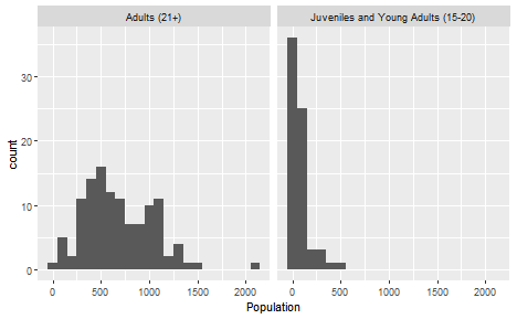 ] --- # Continuous by categorical interactions .pull-left[ In the last few examples, we've plotted with the continuous variable on the x-axis. We can also plot with a discrete variable on the x-axis. In this case we want R to summarise the continuous variable, providing us with the mean and standard error for each level of *cyl* from the *mtcars* dataset. We use `stat_summary()` to do this. ```r ggplot(mtcars, aes(x = factor(cyl), y = mpg)) + stat_summary() ``` ] .pull-right[ 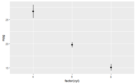 ] --- # Continuous by categorical interactions .pull-left[ Some people like to plot bar charts, with the mean and error bars overlaid on top. We use `stat_summary()` twice, the first time specifying that we want bars using the *geom* argument, the second time just using the defaults. ```r ggplot(mtcars, aes(x = factor(cyl), y = mpg)) + stat_summary(fun = mean, geom = "bar") + stat_summary(fun.data = mean_se) ``` ] .pull-right[ 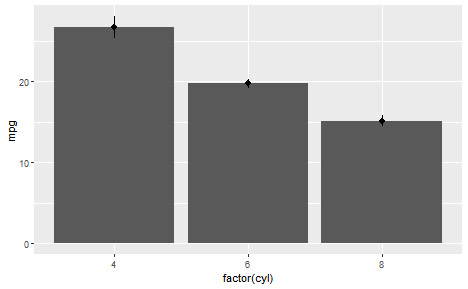 ] --- # Continuous by categorical interactions .pull-left[ But bar charts are not a very good way to show this kind of data! Most of the space occupied by the bars has no data in it, as we can see when we add individual points with `geom_point()`. Stick to using bars to show counts! ```r ggplot(mtcars, aes(x = factor(cyl), y = mpg)) + stat_summary(fun = mean, geom = "bar", fill = "white") + stat_summary(fun.data = mean_se) + geom_point() ``` ] .pull-right[ 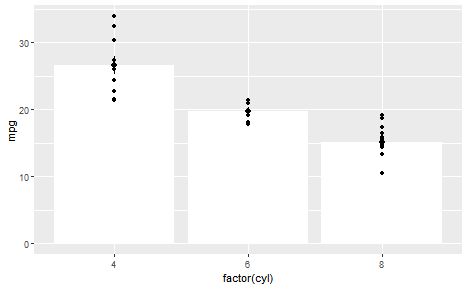 ] --- # Continuous by categorical interactions .pull-left[ Two better alternatives are **violin plots** or **boxplots** ```r ggplot(mtcars, aes(x = factor(cyl), y = mpg)) + geom_boxplot() + geom_point(alpha = 0.5) ``` ```r ggplot(mtcars, aes(x = factor(cyl), y = mpg)) + geom_violin() + geom_point(alpha = 0.5) ``` ] .pull-right[ <!-- --> ] --- class: inverse, middle, center # Jazzing up the plots --- # Better labelling .panelset.sideways[ .panel[ .panel-name[Basic plot] <!-- --> ] .panel[ .panel-name[Better labels] ```r ggplot(data = mpg, mapping = aes(x = displ, y = hwy, colour = factor(cyl))) + geom_point(size = 3, alpha = 0.5, aes(shape = factor(cyl))) + geom_smooth(method = "lm", se = FALSE) + labs(x = "Engine displacement (litres)", y = "Highway miles per gallon", colour = "Cylinders", shape = "Cylinders", title = expression(~bold("Figure 1")), subtitle = expression(~italic("The relationship between MPG and Engine Displacement"))) ``` ] .panel[ .panel-name[Fancier Plot] <!-- --> ] ] --- # Nicer overall **theme** .panelset.sideways[ .panel[ .panel-name[Themes] **Themes** are the way `ggplot()` sets the overall look of the plots. These can control things like: - The colour of the background (e.g. grey or white) - The presence of the gridlines in the background - The choice and size of fonts for text There are several default themes built in! ] .panel[ .panel-name[Basic plot] <!-- --> ] .panel[ .panel-name[theme_bw()] ```r ggplot(data = mpg, mapping = aes(x = displ, y = hwy, colour = factor(cyl))) + geom_point(size = 3, alpha = 0.5, aes(shape = factor(cyl))) + geom_smooth(method = "lm", se = FALSE) + theme_bw() ``` ] .panel[ .panel-name[BW plot]  ] .panel[ .panel-name[theme_classic()] ```r ggplot(data = mpg, mapping = aes(x = displ, y = hwy, colour = factor(cyl))) + geom_point(size = 3, alpha = 0.5, aes(shape = factor(cyl))) + geom_smooth(method = "lm", se = FALSE) + theme_classic() ``` ] .panel[ .panel-name[Classic plot] 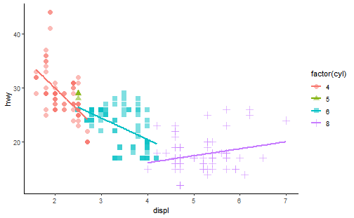 ] ] --- # Changing the colours .panelset.sideways[ .panel[ .panel-name[Basic plot] <!-- --> ] .panel[ .panel-name[Colour brewer] ```r ggplot(data = mpg, mapping = aes(x = displ, y = hwy, colour = factor(cyl))) + geom_point(size = 3, alpha = 0.5, aes(shape = factor(cyl))) + geom_smooth(method = "lm", se = FALSE) + scale_colour_brewer(palette = "Dark2") + theme_classic() ``` ] .panel[ .panel-name[New plot] 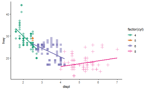 ] ] --- # One final plot .panelset[ .panel[ .panel-name[Code] ```r ggplot(data = mpg, mapping = aes(x = displ, y = hwy, colour = factor(cyl))) + geom_point(size = 3, alpha = 0.5, aes(shape = factor(cyl))) + geom_smooth(method = "lm", se = FALSE) + labs(x = "Engine displacement (litres)", y = "Highway miles per gallon", colour = "Cylinders", shape = "Cylinders", title = expression(~bold("Figure 1")), subtitle = expression(~italic("The relationship between MPG and Engine Displacement"))) + scale_colour_brewer(palette = "Dark2") + theme_classic() ``` ] .panel[ .panel-name[The plot] .center[ 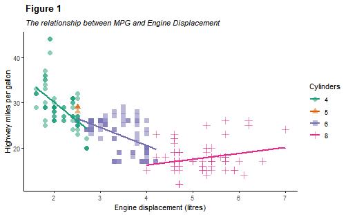 ] ] ] --- # Suggested reading For practice of this week's concepts, see the RStudio.cloud [Visualize Data](https://rstudio.cloud/learn/primers/3) primer. For more general advice on plotting, see R4DS Chapters on [Graphics for Communication](https://r4ds.had.co.nz/graphics-for-communication.html) and [Data Visualization](https://r4ds.had.co.nz/data-visualisation.html), and Kieran Healy's [Data Visualization](https://socviz.co) To prepare for next week, read R4DS Chapter on [Data transformation](https://r4ds.had.co.nz/transform.html)